SDK UI Customization Guide
The latest Entrust IDV SDKs for mobile bring an updated design system for the SDKs' UI, which offers new customization options to integrators.
This guide lists the customization options offered via the SDK's theme interface.
For integration and customization of the Onfido Smart Capture SDKs, including the Onfido Web SDK, please refer to the Smart Capture SDK language and UI customization guide.
Preface - features not yet available
The SDK UI customization framework will introduce additional capabilities over time, with the following features shortlisted for upcoming releases in 2026:
- Font and text style customization
- Ability to align text and components across the screen
- Ability to set individual left/right/up/bottom padding and border on text and components
- Ability to change default images and icons
- Ability to provide a custom spinner (currently only colors can be modified)
How to customize the SDK's UI
The SDK UI customization framework described in this guide has expanded its scope compared to its predecessor and introduces the following key features:
- The same UI customization tokens can be used uniformly across all Entrust IDV SDKs (iOS, Android, React Native)
- To simplify integration, UI customization tokens are affecting all related SDK screen elements
- A comprehensive structure is provided to avoid undue duplication of keys and values
The framework will be extended to also apply to the Onfido Web and Flutter SDKs later in 2026.
The theme interface
Until a dedicated customization dashboard is introduced in Workflow Studio in 2026, the UI customization framework can be used via the SDK's theme configuration interface. This configuration object currently consists of the following major and optional parts:
mode: optionally set to eitherLightorDark. Used to pre-select the SDK UI's themelightColors/darkColors: centralized color references that can automatically be used across the SDK's screensdimensions: dimension tokens to customize non-color properties (such as border radii and various sizes)resources.fonts: configuration object to provide custom fonts to the SDK
 Android
 iOS
iOS React Native
1override fun onCreate(savedInstanceState: Bundle?) {2 ...3 EntrustIdv.start(4 ...5 configuration = Configuration(6 ...7 theme = Theme(8 ...9 mode = ThemeMode.Light,10 lightColors = mapOf(11 ColorTokens.BackgroundColorBrandDefault to "#FF00FF85",12 ColorTokens.ContentColorBase to "#0B1B0B",13 ),14 darkColors = mapOf(15 ColorTokens.BackgroundColorBrandDefault to "#0000FF85",16 ColorTokens.ContentColorBase to "#FF1CFF",17 ),18 dimensions = mapOf(19 DimensionTokens.ButtonBorderRadius to 8f,20 DimensionTokens.SelectionListItemBorderRadius to 4f,21 ),22 resources = Resources(23 fonts = listOf(24 SdkFont(25 name = "custom-font",26 source = listOf(27 FontSource(28 location = ResourceLocation.Local(29 uri = "file:///android_asset/fonts/CustomFont-Regular.ttf" // or "res://font/CustomFont-Regular" (for font files in res/font, no file extension needed in the URI)30 ),31 fontFormat = FontFormat.TTF,32 ),33 ),34 ),35 )36 )37 )38 )39 )40}
1EntrustIdv(2 ...3 configuration: .init(4 ...5 theme: .init(6 ...7 mode: ThemeMode.light,8 lightColors: [9 ColorTokens.backgroundColorBrandDefault: "#FF00FF85",10 ColorTokens.contentColorBase: "#0B1B0B"11 ],12 darkColors: [13 ColorTokens.backgroundColorBrandDefault: "#0000FF85",14 ColorTokens.contentColorBase: "#FF1CFF"15 ],16 dimensions: [17 DimensionTokens.buttonBorderRadius: 8,18 ],19 ))20 )
1entrustIdv.start({2 ...3 configuration: {4 ...5 theme: {6 ...7 mode: ThemeMode.Light,8 lightColors: {9 backgroundColorBrandDefault: '#FF00FF85',10 contentColorBase: '#0b1c0b'11 },12 darkColors: {13 backgroundColorBrandDefault: '#0000FF85',14 contentColorBase: '#FF1cFF'15 },16 dimensions: {17 buttonBorderRadius: 8,18 selectionListItemBorderRadius: 4,19 }20 },21 }22});
Details are provided in the Entrust IDV SDK integration guide.
Dimension tokens (dimensions)
The theme interface exposes a dimensions property for customizing non-color tokens. The full list of available tokens is listed in the Dimension tokens section.
Custom fonts (resources.fonts)
The theme interface also exposes a resources.fonts property to provide custom fonts to the SDK. The full configuration details and list of available font tokens is listed in the Fonts section.
Base color selection and themes (lightColors / darkColors)
To avoid repeating color override across multiple UI components, the SDK's lightColors / darkColors interface can be used to configure colors centrally.
By modifying a color value in both colors sets, all component-level tokens derived from them will be affected.
Integrators would then only need to use the component-specific overrides for exceptions to standard coloring patterns, such as for extra brand emphasis.
For example, modifying the color set for the backgroundColorBrandDefault token in the lightColors and darkColors will apply that color to all component-specific tokens that are assigned the backgroundColorBrandDefault token, such as the background color of the primary button and spinner's main color.
The mapping between the base tokens and component-specific areas is listed in the Components section below.
The full list of available lightColors / darkColors tokens is listed in the Base colors section below.
Unless predefined in the SDK's theme/mode configuration, the UI's theme
(Dark or Light mode) is automatically determined by the SDK based on the
device (or browser) settings. As such, the customization interface is mirrored
for both themes for lightColors and darkColors. It is therefore critical
to implement default colors for both lightColors and darkColors as the
SDK will make use of both sets of colors across the experience (our capture
screens are always rendered in dark mode).
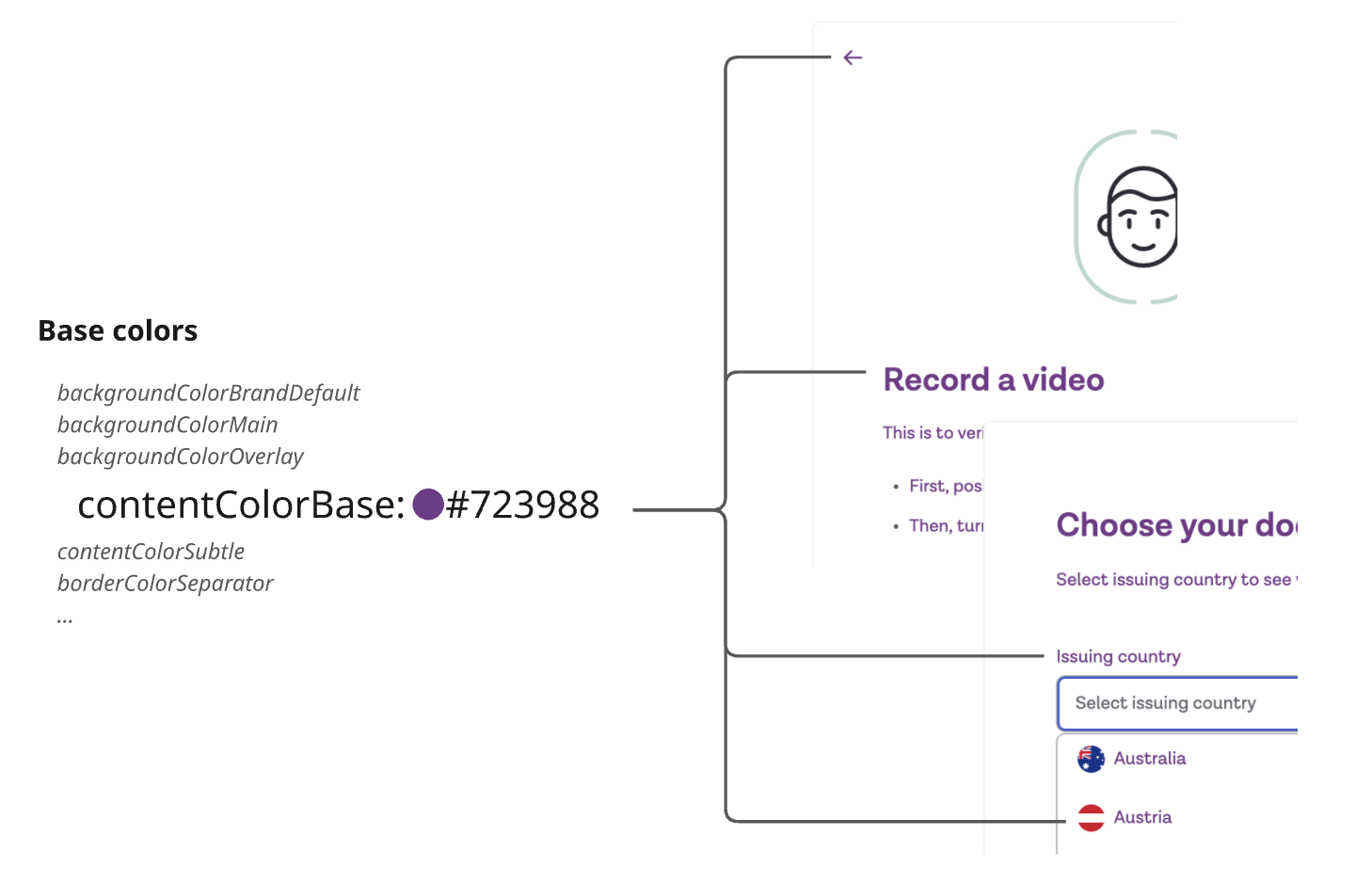
Base colors
Base colors are divided in three categories:
contentColor: affects the 'foreground' color of a component such as its text or iconbackgroundColor: affects the color of the background or surface area of a componentborderColor: affects the color of the outer line of a component
Loading...
Note:
- Each token can be assigned a color value in
hexformat (e.g. '#FFFFFF' for white). Colors can also be provided as 8-character values to account for transparency (e.g. '#FFFFFF85' for white with 50% opacity/transparency) - Colors assigned to both
lightanddarkthemes should provide sufficient contrast for accessibility purposes. It is also recommended to provide sufficient differentiation for thehoverandactivecolor variants
If you are migrating from the Onfido Smart Capture SDK, see the Appendix - UI token mapping in the SDK migration guide for a full mapping of Onfido SDK tokens to these Entrust IDV SDK equivalents.
General Screen Background, Text & Border
The overall screen background, overlay and border colors can be customized by modifying the base color tokens defined in the table below.
| Base Color Token | Description | Light | Dark |
|---|---|---|---|
backgroundColorSurfacePrimaryDefault | General background color of the screen | #22262C | #FFFFFF |
backgroundColorSurfaceSecondaryDefault | Secondary background color used in media containers | #E9ECF0 | #636670 |
backgroundColorOverlay | Color of the semi-transparent overlay visible over live capture screens and when a screen pop-up is shown | #0A0D11CC | #0A0D11CC |
Additionally, the color of the main text elements can be customized by modifying the following base color tokens:
| Base Color Token | Description | Light | Dark |
|---|---|---|---|
contentColorBase | Color of the body of text and titles | #0A0D11 | #FFFFFF |
contentColorSubtle | Secondary text color applied to field descriptions and supporting icons | #53565C | #FFD25C |
contentColorNegativeBaseDefault | Text color used for input validation errors | #D31127 | #FEC9C4 |
contentColorPlaceholder | Color used for placeholder text within input fields | #63676D | #92959B |
Note: The color of text or icons within particular components such as buttons or banners is driven by potentially more specific color tokens as defined in the following sections of this guide.
Key Components
This section presents the components available across the Entrust IDV SDK screens. If you require customization capabilities beyond the scope described in this document, please contact your Customer Success Manager.
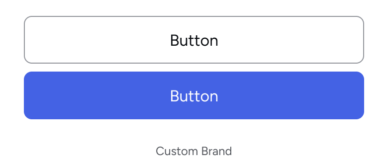
Buttons
While the behavior of buttons is consistent across screens and platforms, colors are driven by a button's 'variant':
| Variant | Example |
|---|---|
| Primary |  |
| Secondary |  |
| Tertiary |  |
| Negative Secondary |  |
| Negative Tertiary |  |
The buttons are currently used in the following parts of the UI:
| Use Case | Description | Variant |
|---|---|---|
| Button Dock | Call To Action buttons located in most screens | primary and secondary |
| (Web SDK) Cross-device | Button on the cross-device desktop QR code screen to display more information | tertiary |
| (Web SDK) Cross-device | Button on the cross-device mobile 'Confirmation' screen for "It's not me" | negative-secondary |
| (Web SDK) Cross-device | Button on the cross-device mobile 'Confirmation' screen for "It's not me" | negative-tertiary |
| Navigation Bar | Back and Close buttons | tertiary |
| Intro screens | Buttons to control the playback of animation on instruction screens | primary |
Note: In the current SDK iteration, it is not possible to replace 'transparent' colors
The corner radius of buttons can be customized using the buttonBorderRadius dimension token.
Loading...
Button Dock
The button-dock is the container at the bottom of most screens that contains either one or two buttons.
In addition to customizing the buttons as defined in the section above, the Button Dock has the following customization options:
| Base Color Token | Description | Light | Dark |
|---|---|---|---|
backgroundColorSurfacePrimaryDefault | Surface color behind/around the buttons | #FFFFFF | #22262C |
borderColorSeparator | Color of the upper border of the Button Dock | #E9EBEF | #53565C |
Note: The relative position of buttons (stacked or side-by-side) is automatically controlled by the width of the available screen area
Navigation Bar
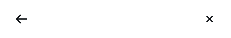
The navigation-bar is the container at the top of screens that may contain the Back and Exit buttons.
In addition to customizing the bottom as defined in the Buttons section, the Navigation Bar has the following customization options:
| Base Color Token | Description | Light | Dark |
|---|---|---|---|
backgroundColorSurfacePrimaryDefault | Surface color behind/around the buttons | #FFFFFF | #22262C |
borderColorSeparator | Color of the bottom border of the Navigation Bar | #E9EBEF | #53565C |
Banner
The banner component is used to callout key instructions or live feedback to the user across the UI flow.
| Variant | Use Case | |
|---|---|---|
info | User callout on introduction or instruction screens | 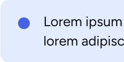 |
warning | User warning appearing during the capture experience or in confirmation screens | 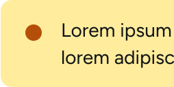 |
error | User error appearing during the capture experience or in confirmation screens | 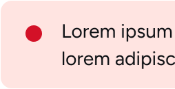 |
Notes:
- The icons currently used within the Banner component cannot be changed
- Capture screens (live camera feeds) are always displayed in dark mode to provide an optimal user experience
The banner component is composed of an overall border, a message and an optional icon.
Loading...
Spinner
The spinner component is present on all loading and waiting screens of the SDK.

| Base Color Token | Description | Light | Dark |
|---|---|---|---|
backgroundColorBrandDefault | Color of the 'progress' section of the spinner | #4462E4 | #4462E4 |
backgroundColorNeutralSubtleDefault | Color of the 'track' section of the spinner | #E9EBEF | #3F454F |
contentColorSubtle | Color of any possible supporting text | #53565C | #D6D8DB |
Note: On Android, the spinner component of the first loading screen (when the SDK is being initialized) only contains a 'progress' section.
Status Icon Tile
The icon-tile component is the large icon present on status screens. It exists in three main variants:
| Use Case | Description | Variant | Example |
|---|---|---|---|
| Confirmation Screen | 'Green tick' when the user has successfully completed a task | positive |  |
| Permissions Screen | Icon representing the required permission type | neutral |  |
| Error Screen | 'Red exclamation mark' shown on error screens | negative |  |
The icon and background colors can be customized for each variant:
| Variant | Base Color Token | Light | Dark |
|---|---|---|---|
positive | backgroundColorPositiveSubtleDefault | #D7F6C8 | #225123 |
positive | contentColorPositiveBaseDefault | #36860F | #B2ED73 |
neutral | backgroundColorNeutralSubtleDefault | #E9EBEF | #3F454F |
neutral | contentColorSubtle | #53565C | #D6D8DB |
negative | backgroundColorNegativeSubtleDefault | #FFE4E1 | #942C2C |
negative | contentColorNegativeBaseDefault | #D31127 | #FEC9C4 |
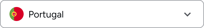
Country Selector
The country-select component is present on multiple screens to allow the end user to select a country from a dropdown list or by starting to type in the main input field.
It is also used to select the phone number country prefix.
Loading...
Note: The country flags cannot be edited or replaced.
Selection List
The selection-list component is a custom button list intended to provide end users with multiple choices.
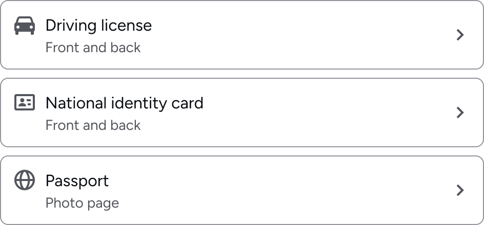
| Use Case | Description |
|---|---|
| Document Type | In the context of Document and Proof of Address, presents the user with a list of document types to choose from |
| Cross-Device Link Method | In the context of cross-device in the Web SDK, selector of the 'link' method available |
| Generic user choice screens | Multiple additional use cases for which the user is given a non-hierarchical choice (e.g. eID selection) |
Note: The individual icons present in the list cannot currently be customized
[Android-only currently] The corner radius of selection list items can be customized using the selectionListItemBorderRadius dimension token.
Text Input Field
The text-input component is used across any screen or component that requires the user to provide a typed value.
Loading...
Checkbox
The checkbox component is a composite element that contains the following sub-components:
- The
containerwhich corresponds to the overall checkbox, offering the customization of the overall border and background colors - The checkbox itself. It is referred to by its two main states/variants:
selectedandunselected - The
iconthat corresponds to the 'tick' within the container - The
labelof the overall component - The
descriptionof the overall component
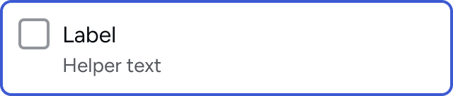
The component itself also follows the standard input states of default, active, hover, disabled and invalid
Overall container
| State | Base Color Token | Light | Dark |
|---|---|---|---|
| default | backgroundColorSurfacePrimaryDefault | #FFFFFF | #22262C |
| active | backgroundColorSurfacePrimaryActive | #FFFFFF | #1F2328 |
| hover | backgroundColorSurfacePrimaryHover | #FFFFFF | #21242A |
| disabled | backgroundColorInputDefault | #FFFFFF | #22262C |
| invalid | backgroundColorInputDefault | #FFFFFF | #22262C |
| default | borderColorSeparator | #E9EBEF | #53565C |
| active | borderColorSeparator | #E9EBEF | #53565C |
| hover | borderColorSeparator | #E9EBEF | #53565C |
| disabled | borderColorSeparator | #E9EBEF | #53565C |
| invalid | borderColorSeparator | #E9EBEF | #53565C |
selected and unselected Checkbox
| Variant | State | Base Color Token | Light | Dark |
|---|---|---|---|---|
selected | default | backgroundColorBrandDefault | #4462E4 | #4462E4 |
selected | active | backgroundColorBrandActive | #2F51E1 | #2F51E1 |
selected | hover | backgroundColorBrandHover | #3A59E2 | #3A59E2 |
selected | disabled | backgroundColorDisabledDefault | #E9EBEF | #53565C |
selected | invalid | backgroundColorNegativeBaseDefault | #D31127 | #D31127 |
selected | default | borderColorBrandDefault | #4462E4 | #4462E4 |
selected | active | borderColorBrandActive | #4462E4 | #4462E4 |
selected | hover | borderColorBrandHover | #4462E4 | #4462E4 |
selected | disabled | borderColorDisabledDefault | #E9EBEF | #53565C |
selected | invalid | borderColorNegativeBaseDefault | #D31127 | #D31127 |
unselected | active | backgroundColorInputDefault | #FFFFFF | #22262C |
unselected | default | backgroundColorInputDefault | #FFFFFF | #22262C |
unselected | disabled | backgroundColorInputDefault | #FFFFFF | #22262C |
unselected | hover | backgroundColorInputDefault | #FFFFFF | #22262C |
unselected | invalid | backgroundColorInputDefault | #FFFFFF | #22262C |
unselected | default | borderColorInputDefault | #92959B | #6F7277 |
unselected | active | borderColorInputActive | #85898F | #66696D |
unselected | hover | borderColorInputHover | #8C8F95 | #6B6D72 |
unselected | disabled | borderColorDisabledDefault | #E9EBEF | #53565C |
unselected | invalid | borderColorNegativeBaseDefault | #D31127 | #D31127 |
icon sub-component
| State | Base Color Token | Light | Dark |
|---|---|---|---|
| default | contentColorBrandOnBrand | #FFFFFF | #FFFFFF |
| active | contentColorBrandOnBrand | #FFFFFF | #FFFFFF |
| hover | contentColorBrandOnBrand | #FFFFFF | #FFFFFF |
| invalid | contentColorBrandOnBrand | #FFFFFF | #FFFFFF |
| disabled | contentColorDisabledDefault | #92959B | #6F7277 |
label sub-component
| State | Base Color Token | Light | Dark |
|---|---|---|---|
| default | contentColorSubtle | #0A0D11 | #FFFFFF |
| disabled | contentColorDisabledDefault | #92959B | #6F7277 |
description sub-component
| State | Base Color Token | Light | Dark |
|---|---|---|---|
| default | contentColorBase | #53565C | #D6D8DB |
| disabled | contentColorDisabledDefault | #92959B | #6F7277 |
Dimensions
The following dimension tokens are currently supported:
| Token | Description |
|---|---|
buttonBorderRadius | Corner radius applied to all primary and secondary buttons (dp / pt) |
selectionListItemBorderRadius | Corner radius for selection-list items such as the document type picker (dp / pt). Currently only available for Android and React Native |
Values are expressed as density-independent pixels (dp on Android, points in pt on iOS). Accepted values: non-negative numbers.
Please note: Dimensions are currently only available for native Android and iOS modules. The same functionality will be added for Web modules in an upcoming release.
AndroidiOSReact Native1EntrustIdv.start(2 configuration = Configuration(3 theme = Theme(4 dimensions = mapOf(5 DimensionTokens.ButtonBorderRadius to 8f,6 DimensionTokens.SelectionListItemBorderRadius to 4f,7 ),8 )9 )10)
1EntrustIdv(2 configuration: .init(3 theme: .init(4 dimensions: [5 DimensionTokens.buttonBorderRadius: 8,6 ]7 )8 )9)
1entrustIdv.start({2 configuration: {3 theme: {4 dimensions: {5 buttonBorderRadius: 8,6 selectionListItemBorderRadius: 4,7 },8 },9 }10 });
Fonts
The SDK supports the use of custom fonts via the resources.fonts property of the Theme object. Custom fonts are applied across all SDK screens.
Each font is defined by a name (used for internal identification) and one or more sources — a list of font locations with their corresponding format, which allows for fallback support.
Supported formats
| Format | Android | iOS | React Native / Web |
|---|---|---|---|
ttf (TrueType) | ✔ | ✔ | ✔ |
otf (OpenType) | API 26+ | ✔ | ✔ |
woff2 | — | — | ✔ (web modules only) |
Font source types
Two source types are available via ResourceLocation:
| Type | Description |
|---|---|
remote | Font is downloaded at runtime from a URL. Not supported in native modules yet |
local | Font is bundled in the host app — URI is the filename as registered in the app bundle (without extension) |
Remote fonts
Remote fonts are downloaded by the SDK at runtime from a publicly accessible URL. Currently, this is only supported for web modules.
Local fonts
Local fonts are bundled directly in the host app. The uri should be the font filename as registered in the app bundle.
Local font support is available on Android only, from version 100.4.0. The font file must be included in the host app bundle ahead of SDK initialization.
AndroidiOSReact NativeYour font file can be placed in either of the following locations in your app bundle:
assets/folder, then referenced by filename using afile:///android_asset/URIres/font/folder, then referenced by font name without the file extension (NOT filename) using ares://font/URI
1EntrustIdv.start(2 configuration = Configuration(3 theme = Theme(4 resources = Resources(5 fonts = listOf(6 SdkFont(7 name = "custom-font",8 source = listOf(9 FontSource(10 location = ResourceLocation.Local(11 uri = "file:///android_asset/fonts/CustomFont-Regular.ttf"12 ),13 fontFormat = FontFormat.TTF,14 ),15 ),16 ),17 SdkFont(18 name = "custom-font-fallback",19 source = listOf(20 FontSource(21 location = ResourceLocation.Local(22 uri = "res://font/CustomFont-Regular-Fallback" // no file extension needed for fonts in res/font23 ),24 fontFormat = FontFormat.TTF,25 ),26 ),27 ),28 )29 )30 )31 )32)
Variable fonts are also supported (on devices with Android 8.0+). XML font family resources are not currently supported.
Add the font file to your Xcode project. Make sure:
- Copy items if needed is checked
- Your app target is checked under "Add to targets"
Register it in your Info.plist under Fonts provided by application:
1<key>UIAppFonts</key>2<array>3 <string>YourFont-Regular.otf</string>4</array>
The font family name can differ from the filename. To ensure the correct name is passed, you can either:
- Open the font in Font Book → look under "PostScript Name"
- Or programmatically after registering the font in
Info.plist:
1for family in UIFont.familyNames.sorted() {2 for name in UIFont.fontNames(forFamilyName: family) {3 print(name)4 }5}
Then pass it to the SDK via Configuration:
1let fontURL = Bundle.main.url(forResource: "YourFont-Regular", withExtension: "otf")23let font = SdkFont(4name: "YourFontFamilyName",5 source: [6 FontSource(7 location: .local(uri: fontURL?.absoluteString ?? ""),8 fontFormat: .otf9 )10 ]11)1213EntrustIdv(14 sdkParameters: StudioParameters(15 sdkToken: "your-sdk-token",16 configuration: Configuration(17 theme: Theme(18 resources: Resources(fonts: [font])19 )20 )21 ),22 callbacks: callbacks23)
Will be supported in an upcoming release
Multiple sources and fallbacks
Multiple FontSource entries can be provided per font — for example to supply both TTF and OTF variants. The SDK will use the first source it can successfully load:
1SdkFont(2 name = "custom-font",3 source = listOf(4 FontSource(location = ResourceLocation.Remote(uri = "file:///android_asset/fonts/CustomFont.ttf"), fontFormat = FontFormat.TTF),5 FontSource(location = ResourceLocation.Remote(uri = "file:///android_asset/fonts/CustomFont.otf"), fontFormat = FontFormat.OTF),6 )7)
Multiple fonts can be provided in the fonts array — for example a regular and a bold variant.